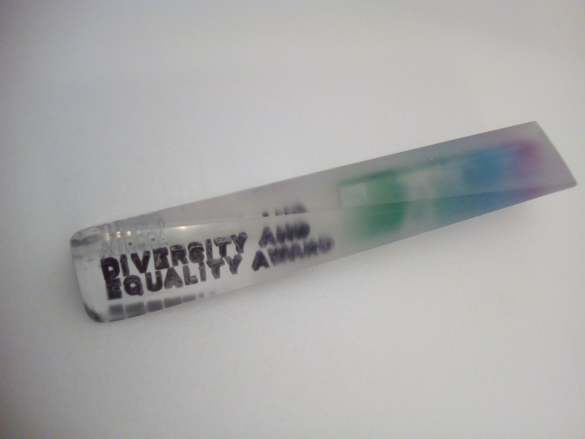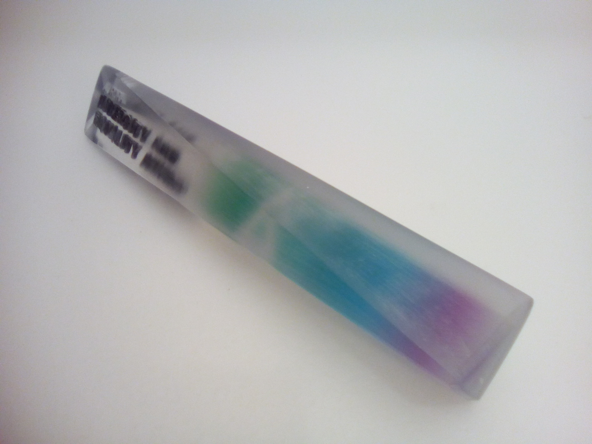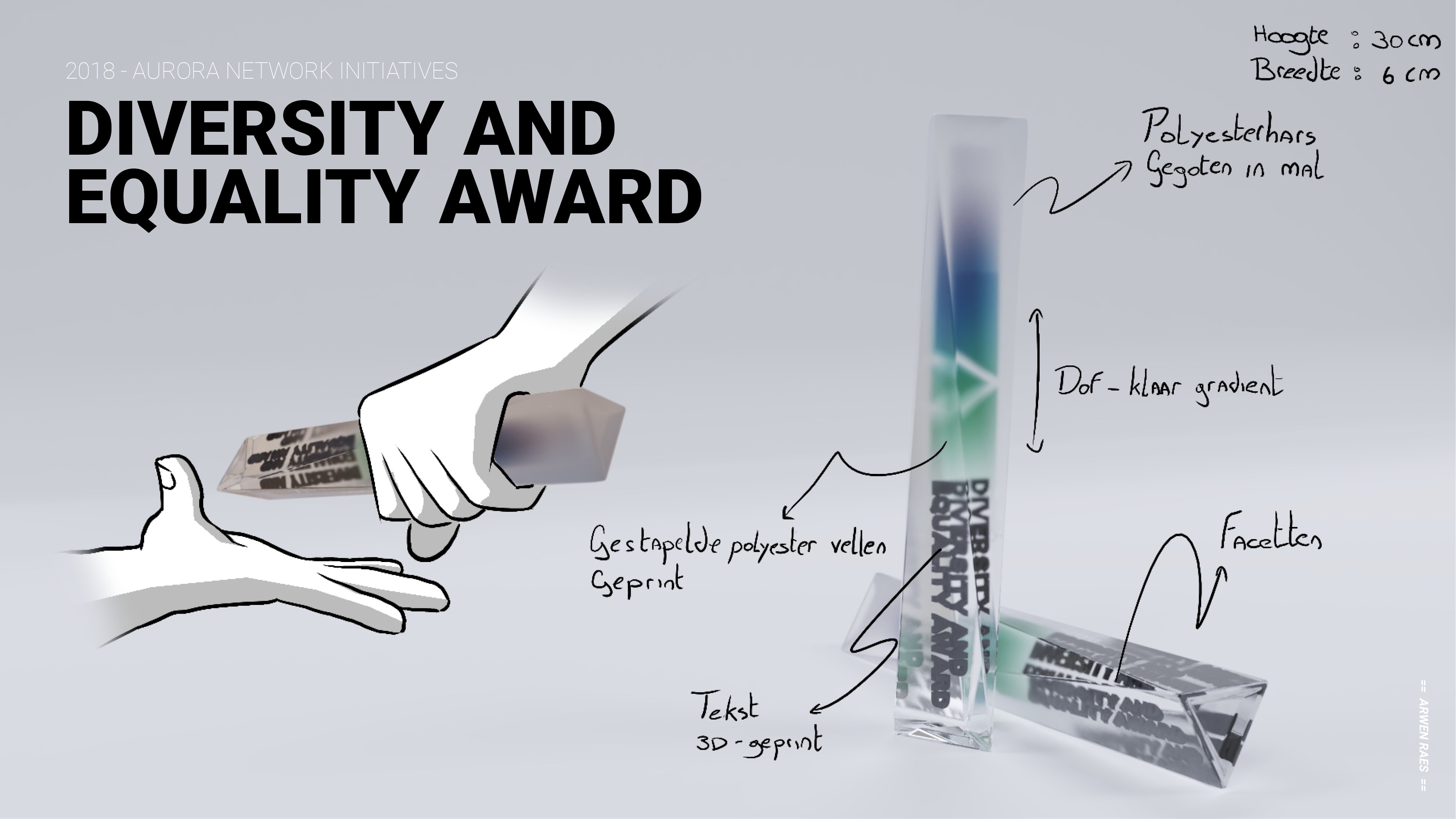
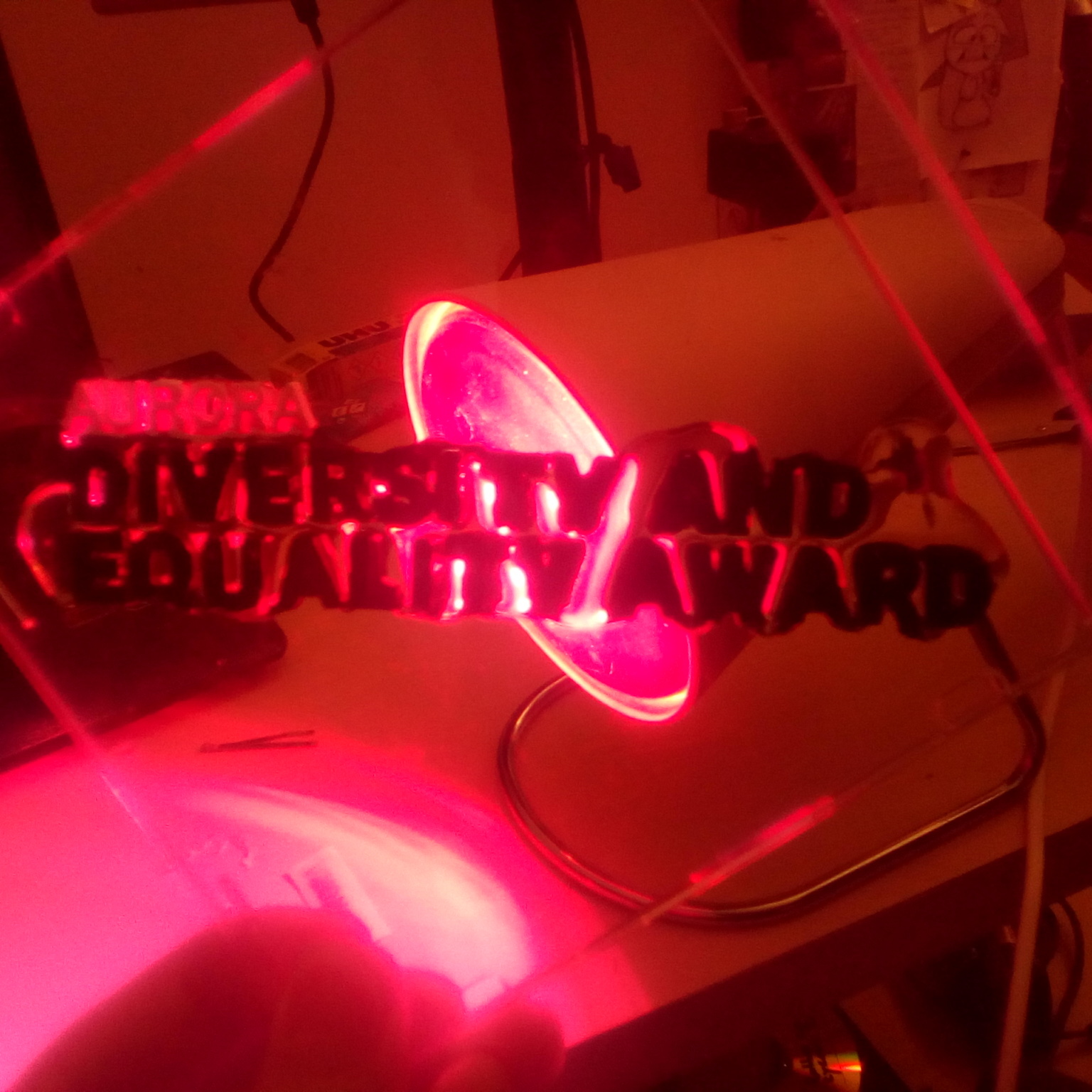
The design of the image above was used to apply at the contest. The winner was given the chance to actually fabricate the award. Having never actually made a finished product before this proved to be quite a challenge. Below are some pictures of the process. The theory behind the design is as follows: Diversity, Equality and different perspectives. These are the three values that are strongly present in the philosophy of this award. A strong metaphor that encompasses these values is the relay stick. The relay stick represents the evolution of a collaborative project very well. Each year the award is given to the next team to carry on the efforts. The faceted and transparent character of the design represents the different perspectives each team has on their challenges. The gradient from fuzzy to clear further represents the trajectory such innovation projects go through.
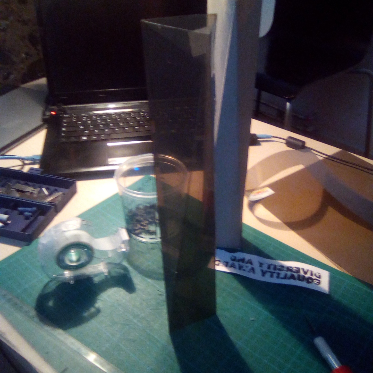
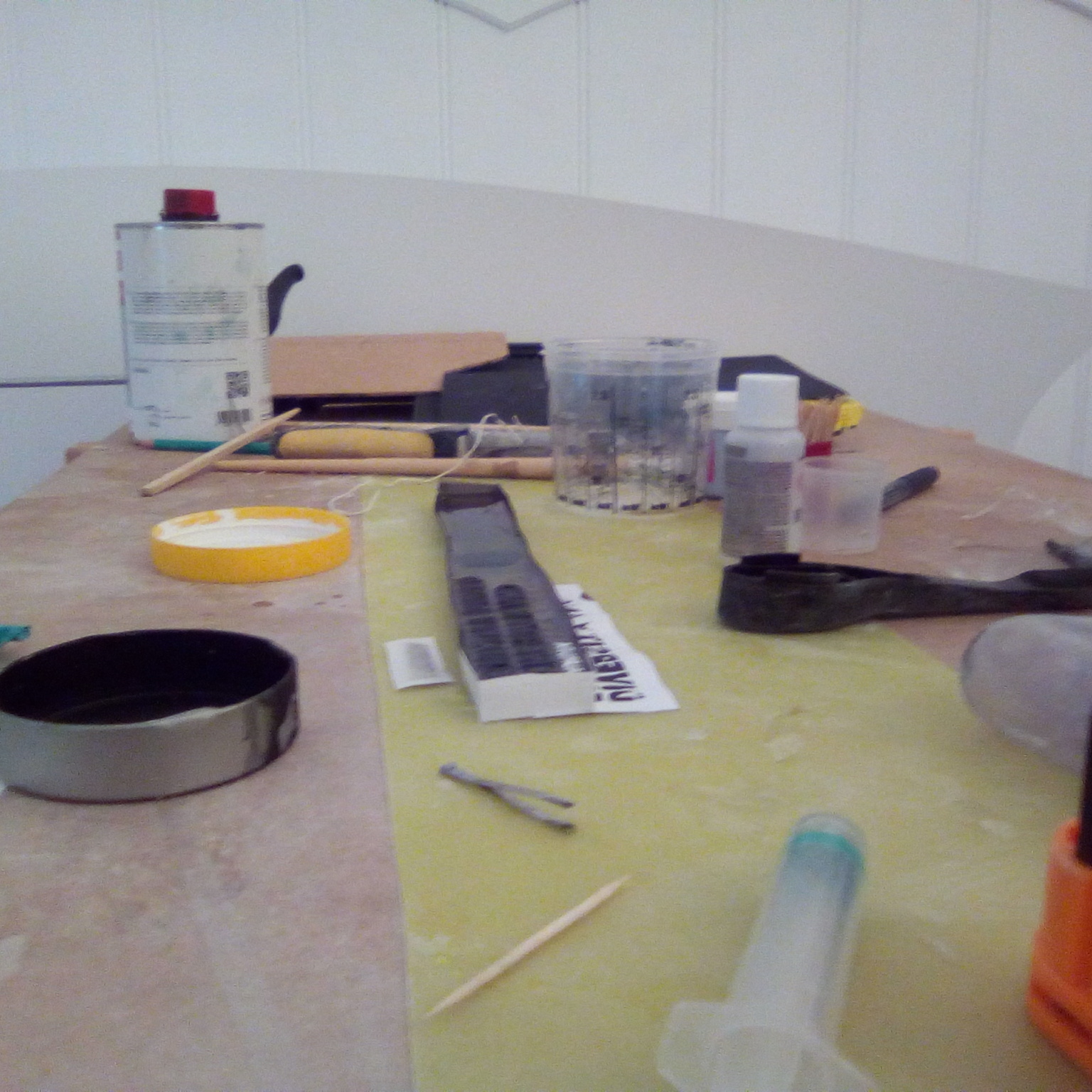
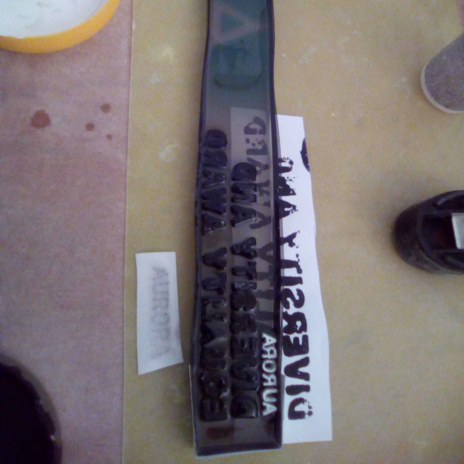
It actually took two tries to get an adequate result. The body was made in epoxy resin, the letters have been printed and painted. To get the gradient effect with the aurora logo I have printed the design on a transparent sheet. These are stacked on top of each other to get the desired depth perception. To prevent air from being trapped between the sheets I have pre-fabricated the core in a separate container as can be seen in the two pictures above. Afterwards this is added to the main body.
Here is the finished result. The edges are still a bit jagged and the paint has dissolved a bit in the resin. In the end a quite satisfactory result. Especially the weight and feeling of holding the award is surprisingly neat.